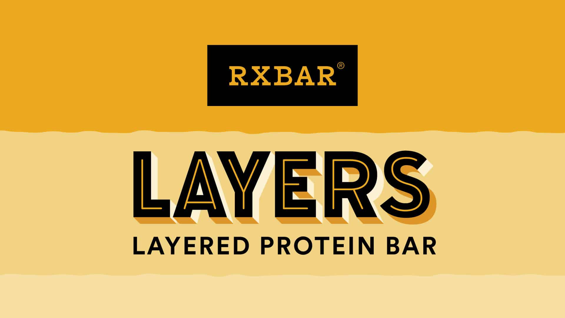
RXBAR
Design Layered in Excellence
The Challenge
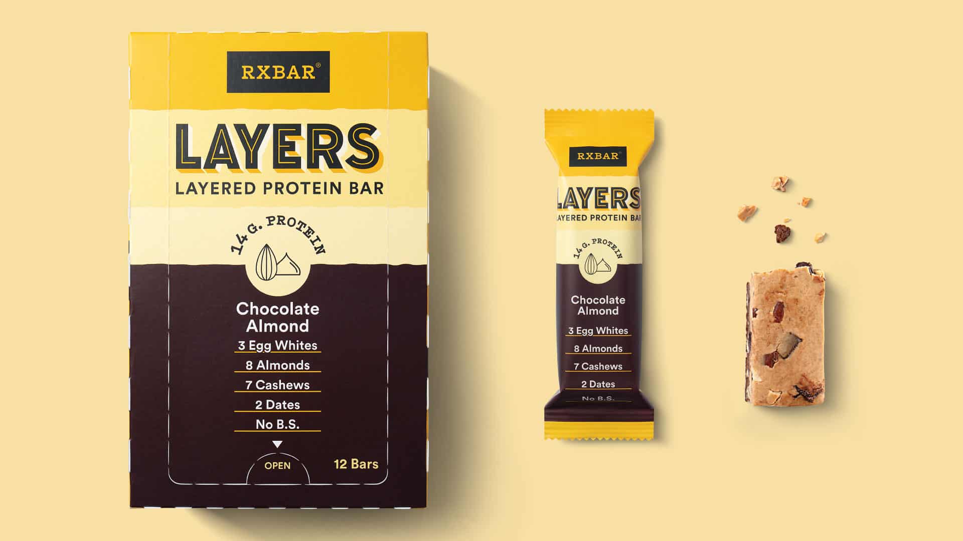
Since 2013, RXBAR has built its reputation on radical simplicity. Clean ingredients, no BS, and packaging that puts what’s inside front and center. When the brand introduced RXBAR Layers, a new line of protein bars designed to deliver a richer, more indulgent experience, the packaging had to evolve without losing what made the original iconic. The challenge was extending the brand into new territory while keeping loyalists grounded and newcomers intrigued.
Our Approach
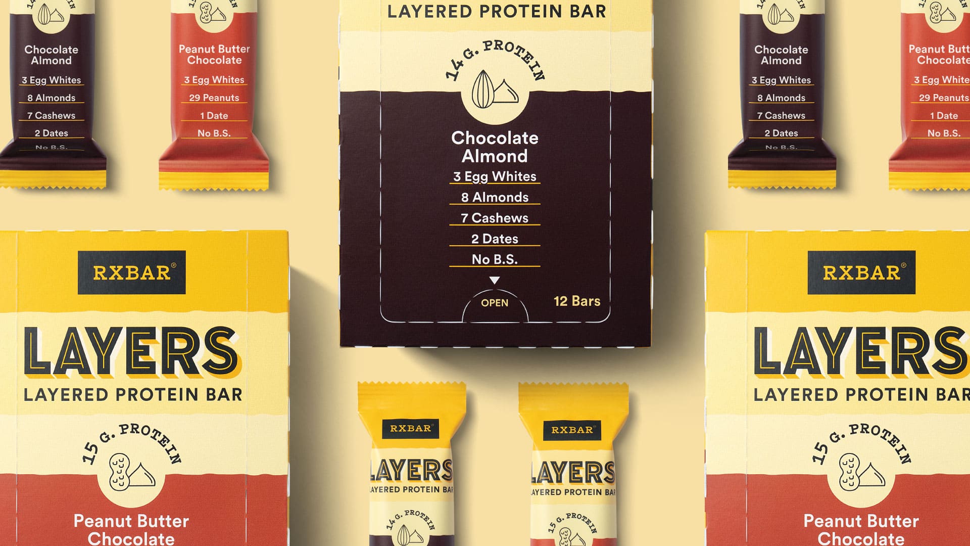
Kaleidoscope designed the RXBAR Layers packaging to stand out at shelf while staying true to the brand’s DNA. We retained the familiar equity consumers already trusted and slimmed the overall silhouette to signal something new. The result is a design extension that feels like RXBAR, but with a layer of indulgence built in.
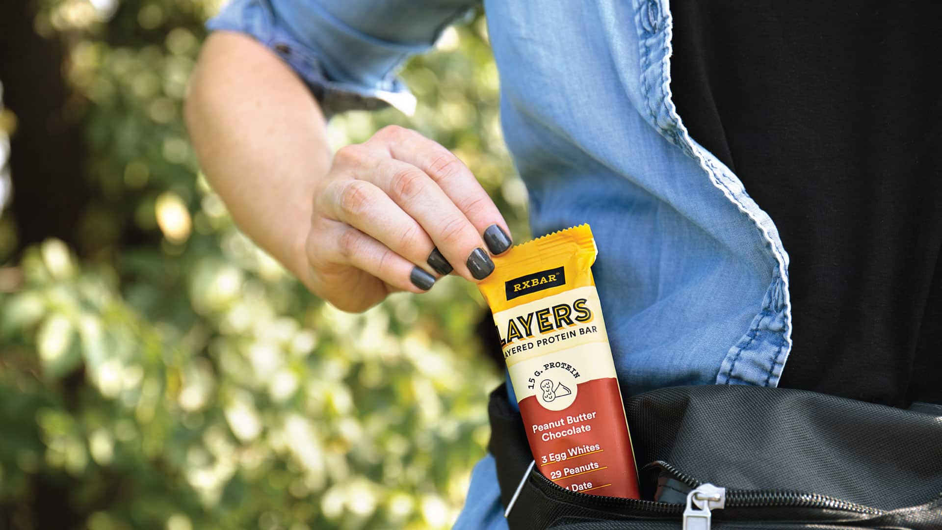
The Impact
RXBAR Layers launched in major retailers and online, earning its place as the go-to bar for consumers who want both guilt-free indulgence and high-protein nutrition. The packaging system bridges brand loyalty and new audience appeal without compromise.
More Work
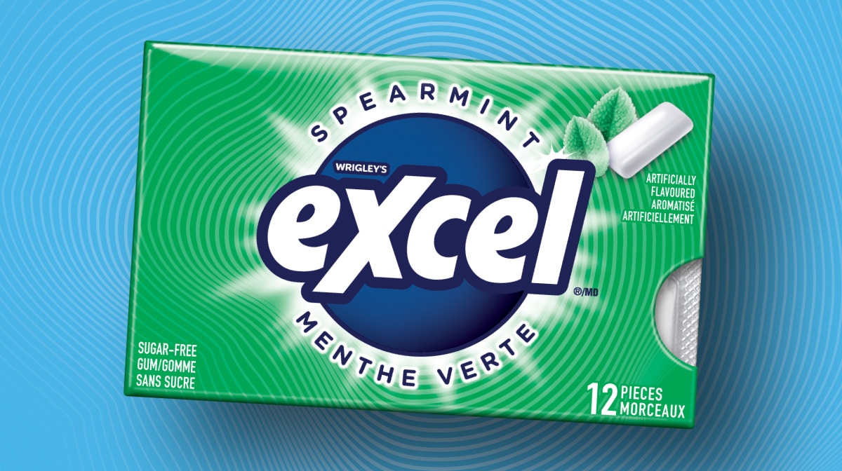
MARS Excel
Packaging Design · Consumer Research · Design System
A Gen Z-targeted redesign for MARS — 40 SKUs, bilingual compliance, and a scalable design system.
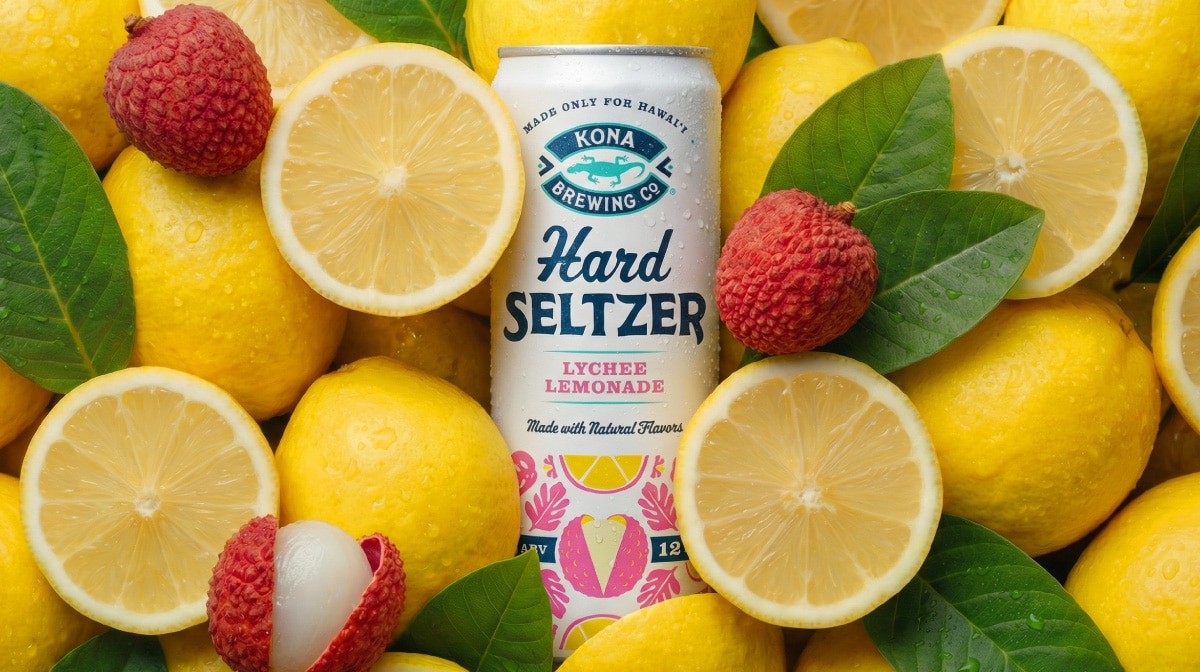
Kona Brewing
Design Strategy・Packaging Design・Visual Identity・Brand World Development
Sun, surf, and something cold. A hard seltzer line with packaging and a brand world built to match.
Get In Touch
Let’s Get Started
Every great project starts with a conversation. Have something in mind? Share a few details and let’s explore what we can build together.